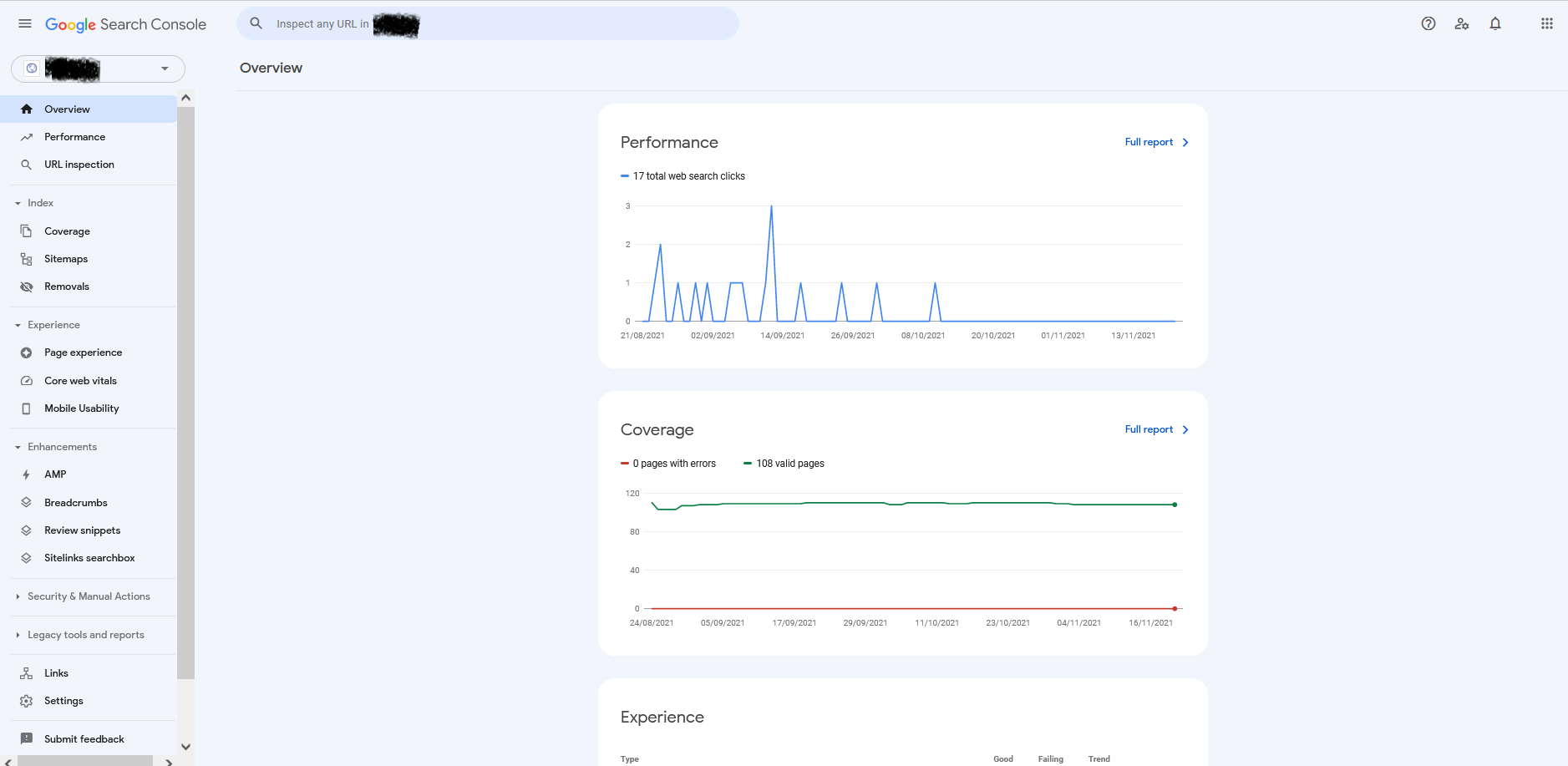
Google Search Console new UI design
Google on 22 November 2021 roll out a new UI for its pioneer platform Google search console.
In this last year, Google updated several new features in in Google search console. Two years back Google Search console was known as Google Webmaster, and SEO masters used GSC for specific features/tools like sitemap update or check robots.txt.
But with new analytics features and reports, Google made the google search console more powerful.
With this new User Interface update, Google wants the webmaster to spend more time on GSC and track their website performance and updates.
This year Google also added a Search console insight feature in the Google search console to have a quick overview about website performance of the last 28 days and how off-page activities/ link building activities are performing
What is new in the Google Search console interface?
Google has not done any change in the left-hand side navigation menu, no new field added to the performance report related to website statistics
As per the initial review, google has only changed the design of the Google search console, where the background color is updated to sky blue and the blocks to show website statics and other information are given new curved border design.
The new design is more towards mobile-first design to get information blocks mobile responsive and user can easily view details in mobile also.

